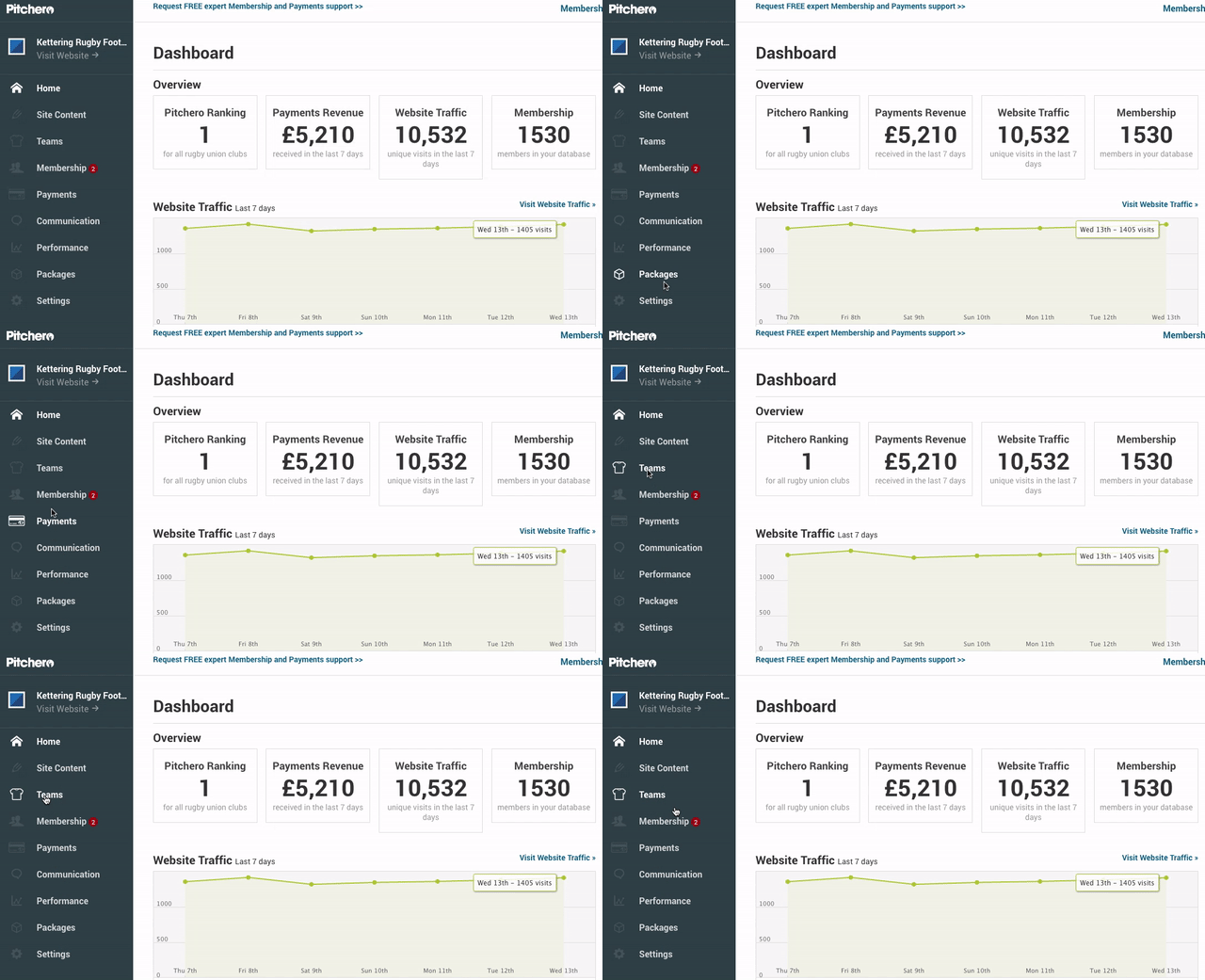
From today, all Club Control Panels will contain a new and improved vertical navigation menu, located on the left hand side of your screen.
Don't worry, none of the navigation options have changed. This is just an updated way for you to access the usual areas of your control panel such as Teams, Membership, Settings etc.
We've been using this new nav at Pitchero HQ for a little while and we love it, so we think you will too! Here we preview exactly what has changed, plus give you a sneak peek at another update that is just around the corner.
What's changed
Navigating your way around your control panel is now done using the vertical navigation on the left side of your screen.
Simply click on the section you want to access, e.g. Payments or Settings, and that section will load on your screen.

You can then use the navigation to access the different pages within that section, or quickly jump to a different one.
We've also moved the button to switch your site between Live and Not Live. It's now found in the "Settings" area of the website, under the "Website Settings" option.
Why we made the change
As with many of our updates, we made these changes to improve your experience when using Pitchero, and to save you time when performing everyday club admin tasks.

In this instance, we've made these changes with mobile usage in mind and will help us reach our goal of making the Club Control Panel totally responsive - making it even easier to update the site on the move.
We've also been able to free up space, making a less cluttered control panel, that allows you to get your admin tasks done, so you can focus on the game.
Coming soon...
Over the past few months, we've been BETA testing a new Teams area of your control panel, which should simplify the way you manage your team members, especially when using a tablet or mobile device.
We've had some great feedback, so we're planning on replacing the old Teams section with the shiny new mobile friendly version imminently. Keep your eyes peeled on the blog for more info.
